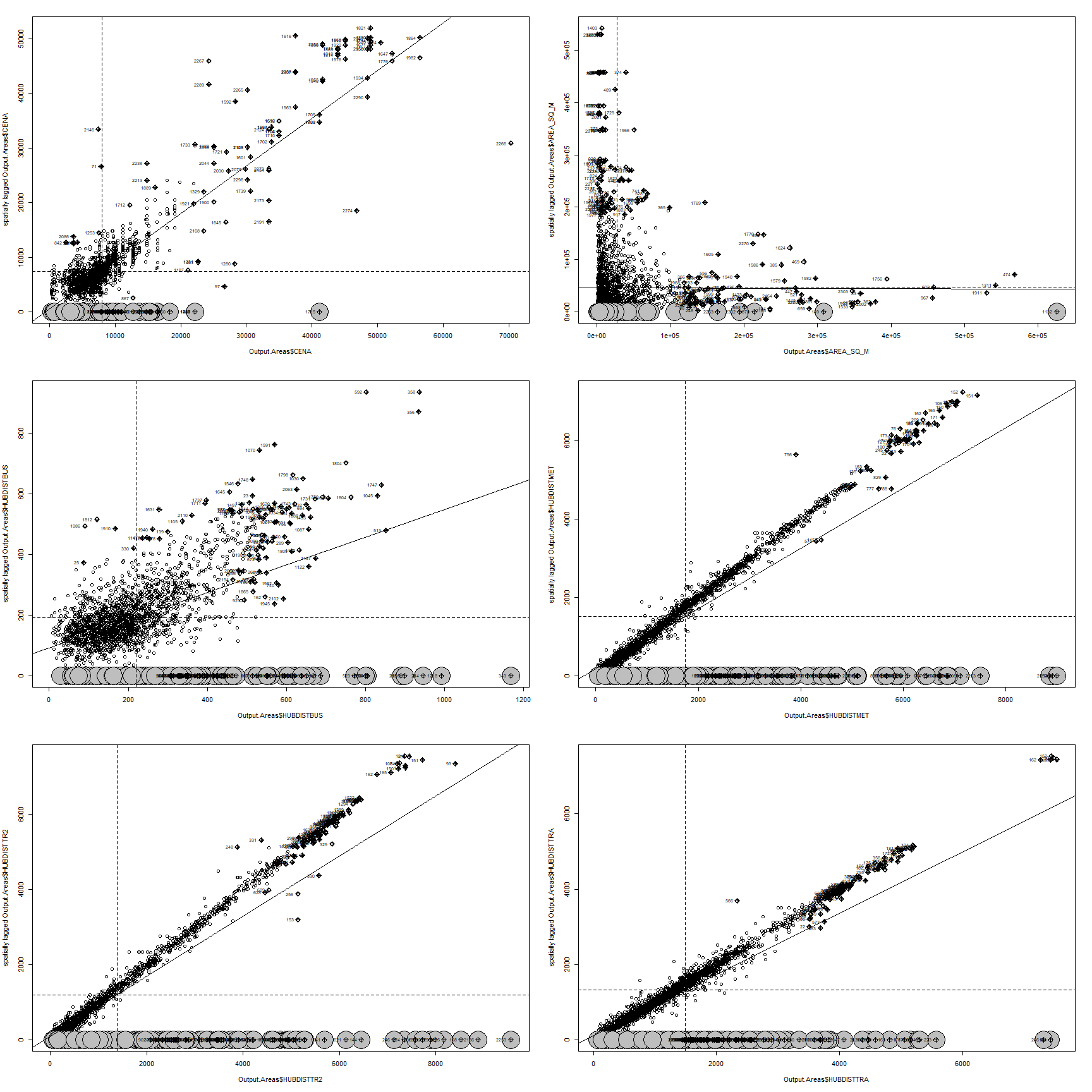
Local spatial autocorrelation investigates the relationships between each observation and its surroundings, rather than providing a numerical summary of these relationships across space. Lets start by creating a moran plot for every variable. This type of graph depicts the spatial data against its spatially lagged values, augmented by reporting the summary of influence measures for the linear relationship between the data and the lag.
Moran plot for every variable is depicted on the figure ??. The plot is divided into four quadrants. In the upper right corner there is the first quadrant, upper left corner corresponds to the second, bottom left to the third and bottom right to fourth. For the Price variable (first plot), we can observe that the vast majority of the observations are clustered in the third quadrant. The third quadrant corresponds to low values surrounded by low values. The interpretation can be that the polygons with lower land price tends to be neighboured by another polygons with (relatively) low prices. In the empirical analysis chapter, when investigating spatial distribution of land price on the figure ??, similar cluster of low land price areas was identified North of the city center. We can see that in the second quadrant that corresponds to the low values surrounded by high values and in the fourth quadrant that corresponds to the high values surrounded by low values there is not many observations. It can be concluded that the city does not have many mixed neighbourhoods with respect to socioeconomic status of its inhabitants. Similar clustering pattern with most observations in the third quadrant can be observed for nearest bus stop distances. However this time the dispersion is more apparent. There is way more observations in the first quadrant, meaning that there are many polygons with relatively high distance to nearest bus station neighbouring with similar characteristic polygons. The observations for nearest metro,tram and train station distances seems to follow similar pattern as they are all aligned in diagonal line between first and third quadrants. This arrangement implies that there are either well connected neighbourhoods with low distances to nearest tram/train/metro stops or areas with bad connectivity and nothing between as there are only few points in the second and fourth quadrant.
How are particular moran statistics for each component distributed across spaced is analysed in dedicated chapters with links listed below:
- Spatial distribution of moran statistics for price
- Spatial distribution of moran statistics for area
- Spatial distribution of moran statistics for nearest bus stop distance
- Spatial distribution of moran statistics for nearest metro station distance
- Spatial distribution of moran statistics for nearest tram stop distance
- Spatial distribution of moran statistics for nearest train station distance